Checking in on Fast

For those of you that don’t know, Fast is a one-click and login checkout tool. To date, they’ve been primarily focused on ecommerce sites which puts them up against the likes of Shop Pay, Apple Pay and other simple purchase solutions.
They have a nifty purchase mechanism that allows them to process a payment on a single tap, with no confirmation needed from the user, assuming the user has purchased an item using Fast Checkout in the past. Then you get a countdown bar at the top to cancel or modify your order as seen in the video below.
Basically, it works like this. At some point, as a consumer, you will presumably encounter a Fast checkout experience in the wild and be intrigued to use it. The branding works well here:
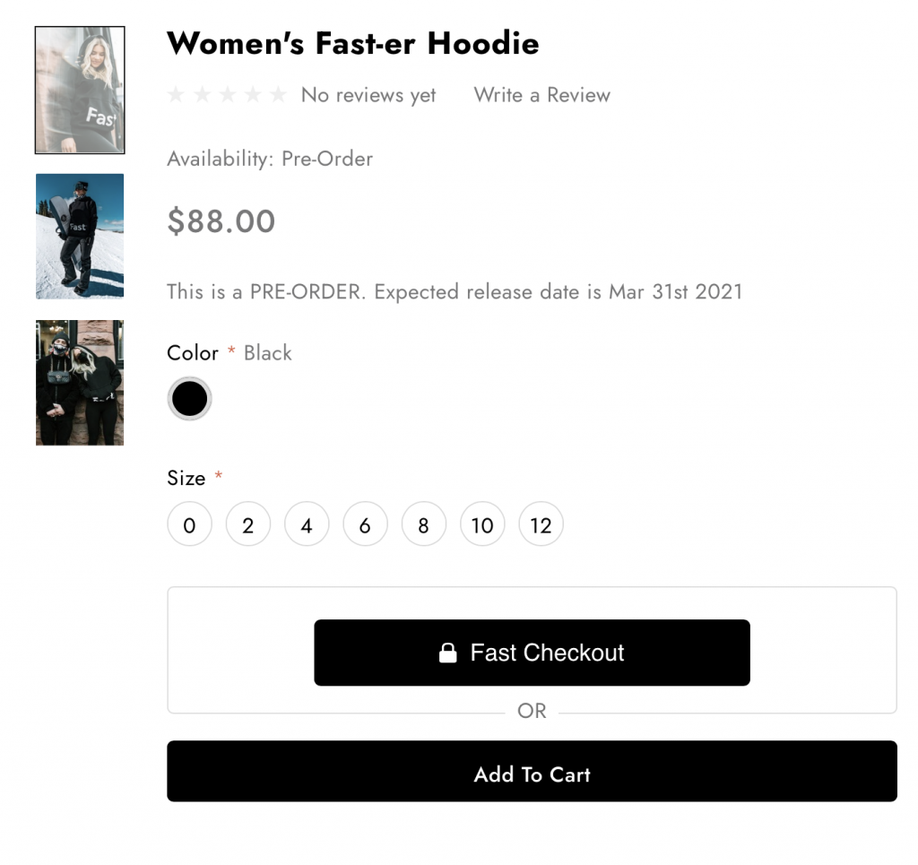
As a user, you don’t necessarily know right away that you’re signing your details away to a new service. The branding very much looks like it says “Fast Checkout” as opposed to “{{brand name}} Checkout”, so kudos for the branding, even if it does feel a bit like a dark pattern.
After you make a selection, you might get this fun little bug where the quantity numbers are actually above the error message.
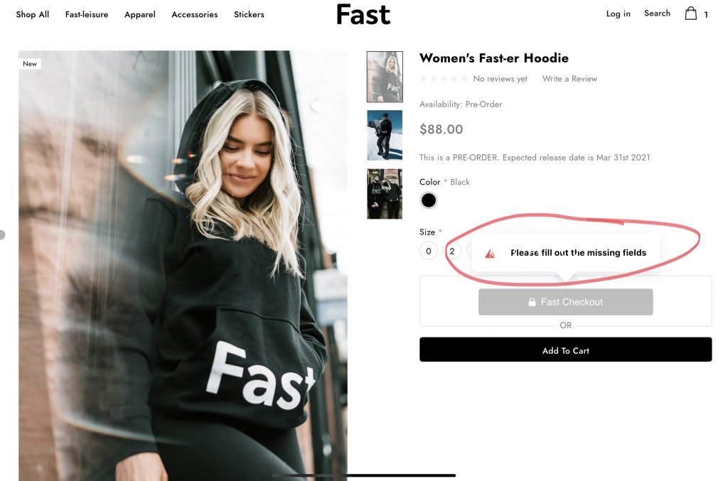
It’s a bit of a nitpick, but you don’t really expect any errors on the shop itself since it’s both their best demo and heavily pushed by the team on Twitter.
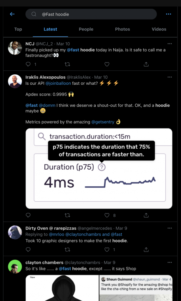
So anyway, after you’ve been ushered into this funnel by hitting the “Fast Checkout” button, you get a screen that flashes at you with a message that’s definitely too long to read considering it’s up for .5s, which is a bit ironic given the text and what happens next.

.5s later and we’re in! Err, actually we are not in. Time to fill out some forms.
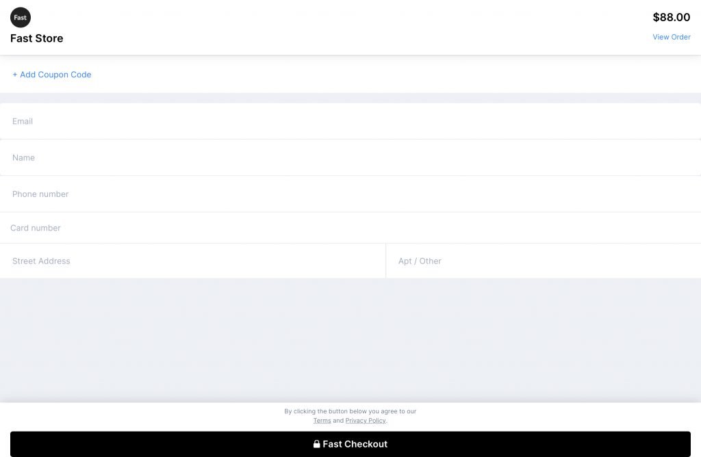
What immediately strikes me is how this just looks like any other stack of forms. Of course, I haven’t created an account yet, but still, it’s a bit lackluster.
Anyway, let’s try changing the quantity, because I decided I need a few of these hoodies.
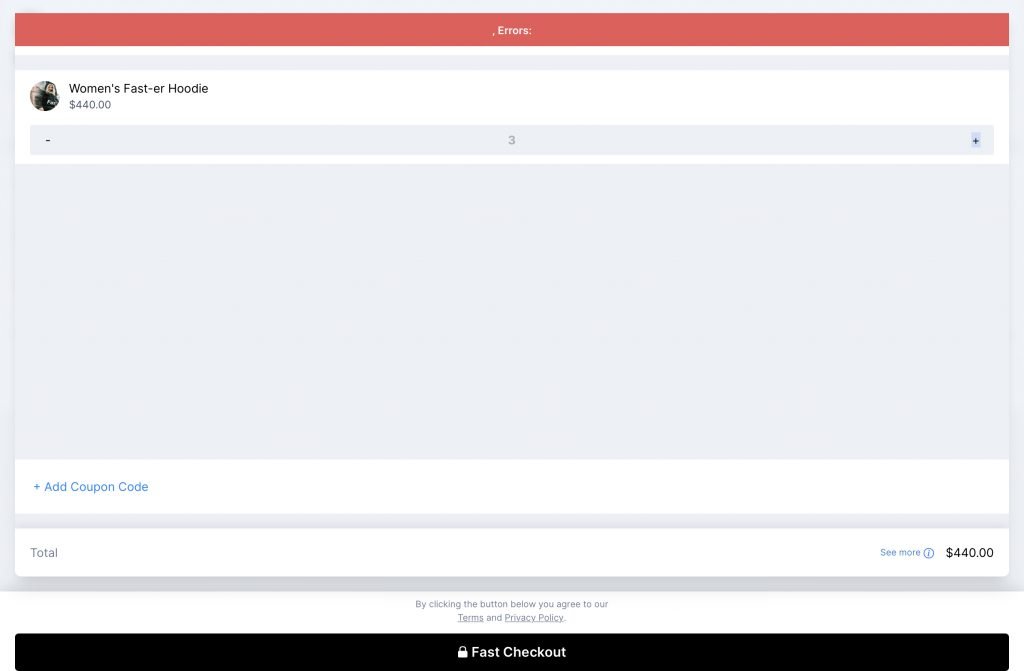
That’s a funky error message. And 88*3 is definitely not 440. Ok, time to bail and try again. But wait.
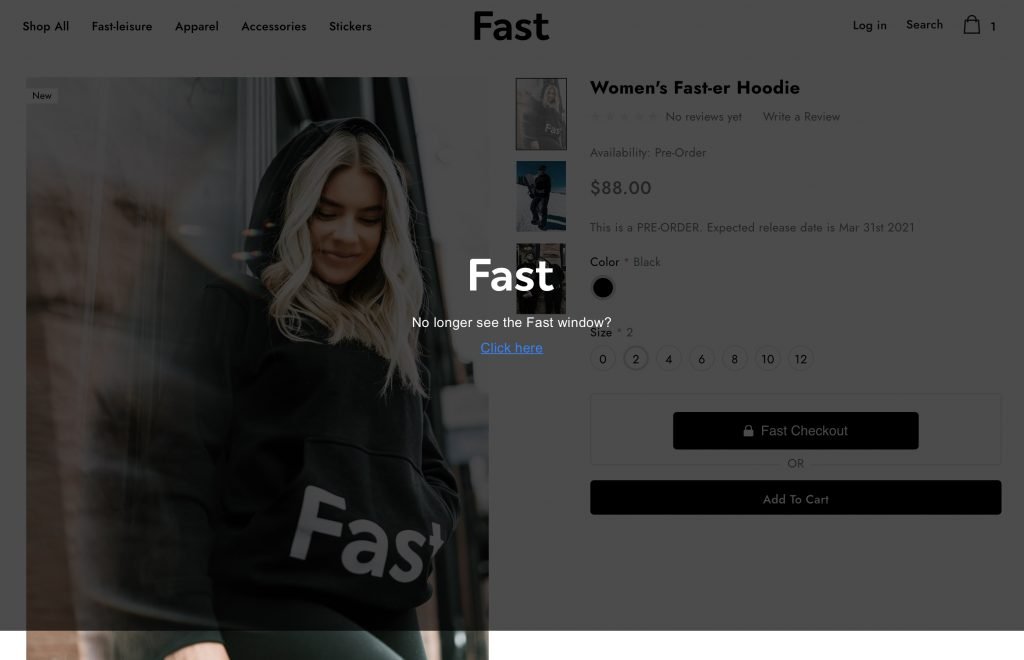
This is what the previous tab looks like, complete with the bottom of the screen peeking out from behind the curtain. Also, the click here button does nothing. Hard refresh and we’re back, but that’s where the journey ends today.
After all, this little check in piece is about how well Fast is doing (from the outside looking in). It’s definitely not about the twitter drama surrounding the CEO or the price of the hoodies.
So let’s see how Fast is doing.
First, Fast officially launches via the not so fast press release in September of 2020, then soon after released news of an epic 102 million Series B.
Potentially one of the most interesting parts of that round is the inclusion of Stripe as one of the investors. They were at 90 employees with plans to hit 200 by EOY, which is growing quite rapidly.
Time to see if we can figure out if their adoption rate is running parallel to their growth rate. Let’s start by heading over to BuiltWith.

According to BuiltWith, Fast was installed on 523 websites and is currently on 459 live websites. Most of those are based in the US and the largest customer, SoloStove, does roughly $378K in revenue.
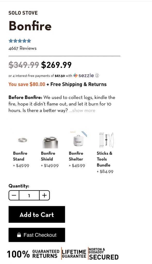
Wonder what happens when you change the quantity.
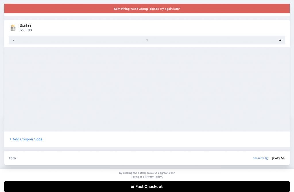
Looks like if you change the quantity before the loading spinner has finished spinning, it errors out pretty reliably. Anyway, back to the hunt.
Fast is currently available on Woocomerce and Bigcommerce, which are significant platforms, but is not yet available on Shopify. Shopify has its own solution Shop Pay for that.
Time to check out BuitWith again as a point of comparison. Maybe the BuiltWith index is just drastically undercounting?

With 1.6m total sites and 568K live, there’s a clear advantage for Shop Pay, which is to be expected, after all, Fast hasn’t been live all that long.
So over to Google Trends.
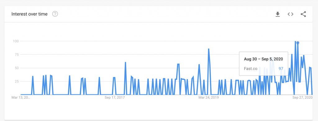
Looks like they had a spike near launch and have been mostly back to the baseline since. This is for all searches for “Fast.co” but searches for their flagship product “Fast Checkout” seem similar.
I’m still trying to get a feel for general adoption, so let’s check out some reviews. Here’s what we have from BigCommerce:
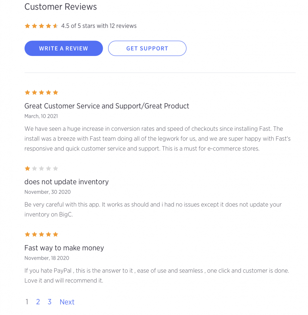
It looks a bit like low usage right off the bat. There’s 12 reviews and the first two pages are all from the same 2.5 week period in November, all 5 stars, with similar language. very sus.
Over to Woocommerce. This one is strange. They have an App Store, but if you try to sign up via Fast you get hit with a generic form and they’re missing altogether from the Woocommerce store.
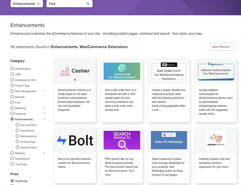
However, a competitor emerges. Bolt looks like a very similar company and they’ve at least managed to secure a placement in the Woo store (also about 3x the live sites on BuiltWith). If we head back to the SoloStove profile, we can see that it’s actually built with Bigcommerce as well.
My guess is that Woo adoption is very low and Fast is primarily on the only place it’s available as a plugin, which is the Bigcommerce store.
But with 100m+ in the bank, they won’t be hurting for awhile. But how are they spending it?
Well, they’re running a bunch of search ads, but it’s a bit strange.
For example, they’re running ads on the phrase “stripe for woocommerce” and related terms, but they’re linking to their generic /sellers page when they should be linking to their dedicated woo page. Further, they don’t actually offer “stripe for woocomerce” as far as I can tell.
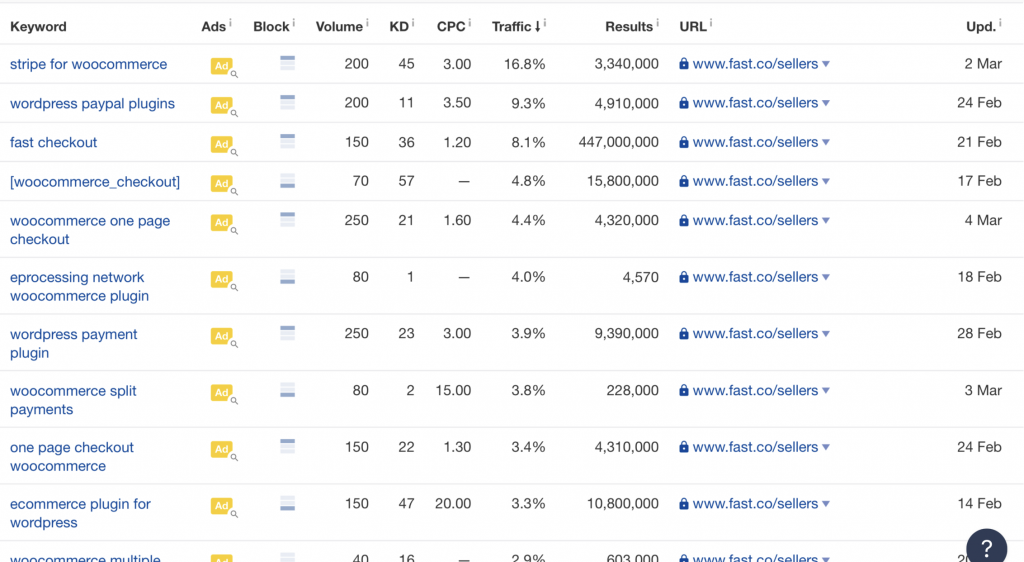
A rough back of napkin suggests they’re losing hundreds of dollars a day bidding on keywords they have a very low chance of closing on.
While you could make an argument for awareness, some of these keywords such as the pictured “woo commerce split payments” (???) is costing the an eye-watering $15 per click! And they don’t have any relevant to splitting payments on their platform.
It’s an interesting promise. Fast says hey, skip the big guys and try out this indie payment processor (backed by Stripe) that allows you to purchase things in a single click.
What’s missing is adoption. It’s tough, their major competitors (Amazon, Apple, Shopify, etc) all have massive user bases they can easily leverage adoption into another vertical like “friction-less payments”. They’ve tried to show they option through the Fast branding – stickers, hoodies and filters with an astronaut helmet like in this kind of creepy video.
It seems unlikely that they’ll end up on Shopify given their competitors aren’t there and they even have a dig at Shop Pay in their launch video.
Even Stripe has Stripe Checkout, which is a wonderfully designed checkout experience that integrates well with their anti-fraud tools. I even use it for one of my side projects, Snazzy.
Stripe may be their exit opportunity, but the tech needs to be better or at least more innovative that what the folks at Stripe can manage on their existing platforms.
I mostly believe in the purchase mechanism that Fast uses and I dig the branding work they’ve done although their paid acquisition needs work.
Their CEO does a spin on the “Built In Public” mantra on Twitter, but I don’t believe they have released the typical numbers like users, revenue, etc but if you’re interested in hearing his thoughts on building the company you can follow him on Twitter.
Fast is living up to their name though and raising buckets of cash while growing the team at a rapid rate. I’m looking forward to checking in a year from now and seeing where they end up.
Pre-publish edit: I went back to the Fast site to grab one more screenshot of their “Fast Login” product and I can’t actually get to the site itself (fast.co) unless I finish creating my account which I bailed out of on their shop subdomain.

There’s no way of actually accessing the site anymore without creating an account.
Post-publish edit: Turns out none of the links on the buyers page work, they’re all naked anchor links. That includes links to “Delete your information”. 🥴